Employee Advocacy Statistics for Marketers [Infographic]

At this point, your company is probably investing time and money into social media, but a key component still missing from most social media marketing efforts is an employee advocacy program. These stats show why that’s likely a big shortcoming. Read the full article at MarketingProfs Copyright 2020 High Level Studios LLC.
Understanding WordPress SEO: Ultimate Guide

Key Takeaways Understanding SEO Basics What is SEO Importance of SEO How SEO Works Setting Up WordPress for SEO Visibility Settings Permalinks Update WWW vs non-WWW Optimizing WordPress Content Blog Post Optimization Using Tags and Categories Image Optimization Enhancing WordPress with SEO Plugins Choosing SEO Plugins Utilizing XML Sitemaps Internal Linking Strategies Advanced WordPress SEO […]
High Level Studios LLC. Receives Design Rush Top Software Companies of 2020 Award

High Level Studios LLC. Receives Design Rush Top Software Companies of 2020 Award We are very excited to announce that High Level Studios LLC. Receives Design Rush Top Software Companies of 2020 Award. Thank you for all your support! DesignRush Rankings Overview December 2023 Release In December 2023, high level studios llc. made waves […]
Let’s Discuss the Best 2024 Digital Marketing Strategies with HighLevelStudios.com

Let’s Discuss the Best 2024 Digital Marketing Strategies with HighLevelStudios.com Future of Digital Marketing Effective Website Design Enhancing User Experience Mobile-responsive Importance SEO and PPC Management The Future of SEO Dominating Featured Snippets Social Media Management Evolving Landscape Utilizing Video Content Influencer Marketing Evolution Tips for Success Impact on Business Growth Engaging Content Strategies Video […]
SEO and Digital Marketing with AI: Embracing the Future

SEO and Digital Marketing with AI: Embracing the Future Key Takeaways AI in Digital Marketing Understanding AI Impact on Strategies Guide to AI Marketing AI’s Role in SEO Driving Future SEO Content Optimization User Intent Personalization Content Creation with AI Elevating Content Quality Balancing Creativity Human Expertise and AI Importance of Balance Expertise in Optimization […]
Google Maps Optimization: 10 Master Tips

Key Takeaways Optimize Google My Business Profile Utilize Relevant Keywords Encourage Customer Reviews Add High-Quality Images Ensure NAP Consistency Create Local Landing Pages Use Google Posts Implement Schema Markup Monitor Insights Regularly Engage with Q&A Section Closing Thoughts Frequently Asked Questions How important is optimizing my Google My Business profile for local search visibility? What […]
The Ultimate WordPress SEO Strategy: Boost Your Traffic in 2024

Key Takeaways What is SEO for WordPress Definition of SEO Benefits of SEO for WordPress Sites Key Features of WordPress SEO User-Friendly Setup and Interface Advanced SEO Analytics Tools Schema Markup Options Image Optimization Techniques Local SEO Enhancements Essential Tools for WordPress SEO Importance of XML Sitemaps Utilizing Keyword Analysis Tools Role of Social Media […]
AEO Marketing Company | Expert Answer Engine Optimization Services
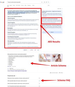
Key Takeaways What is Answer Engine Optimization? 1. Define Answer Engines 2. AEO’s Role in Digital Marketing 3. Why AEO Matters Now AEO vs. Traditional SEO: Key Differences Focus on Direct Answers Targeting Featured Snippets Voice Search Optimization Why Prioritize AEO for Your Business? Capture Zero-Click Searches Build Audience Trust Gain Competitive Advantage Adapt to […]
The Key Google Ranking Factors for 2025 You Need to Know

Key Takeaways The Search Evolution From Keywords To Concepts To Intent Core Ranking Pillars 1. Demonstrable Expertise 2. Authentic Experience 3. Verifiable Trust 4. User Satisfaction Content Authenticity Human-First Creation Responsible AI Use Avoiding Scaled Content Setting Clear Guidelines Technical Foundations Site Usability Page Speed Core Web Vitals Aligning with Best Practices The Reputation […]
How to Obtain AI Citations: 5 Essential Steps for Accurate Referencing

Key Takeaways The New Authority Beyond Search Engines AI as a Source The Trust Factor Earning AI Citations 1. Foundational Trust 2. Niche Dominance 3. Original Data 4. Clear Formatting 5. Technical Directives AI Citation Patterns The Synthesizer The Curator The Aggregator Verifying AI Sources Fact-Checking Source Evaluation Cross-Referencing The Citation Ecosystem Your Content’s Journey […]